
Picplace is a simple and free app to capture the places you loved with or without data service. Simply take a photograph of your new favorite spot with your smart phone and Picplace allows you to capture it with or without data service by using the picture’s GPS coordinates. (source: picplace.co)
COMPATIBILITY: requires iOS with iPhone and iPad.
LANGUAGES: English, French, German, Spanish
APP STORE: Learn more >
PROJECT BACKGROUND
For the updated release of the App, I joined the Picplace Team to collaborate on the conception and design of new features and enhancements. I started by collecting user feedback and reviews from the latest release version. During the research process, I assembled a new competitive analysis and read usability studies to understand our targeted users’ needs and behaviors. In collaboration with the Product Owner, we brainstormed new concepts to develop for the rerelease.
INDUSTRY
Computer Software
COMPANY
Freelance
MY ROLE
UX/UI Designer

1. User Objectives
• To take a picture of a place to remember it again
• To label the pictures
• To write a note in their location bookmarks
• To locate the place using GPS technology
• To access their bookmarks offline
• To personalize their bookmarks with photo filters
• To visualize bookmarks in map view
2. Business Objectives
• Increase by 28% the number of downloads
• Maintain a user base of 2,500 to 3,500
• Increase engagement rate of first-time and repeat users
3. Problems
• Some users said that it would be helpful to find a bookmarked place on a map in addition to the alphabetical list—which could become lengthy over time.
• Currently the App is supporting 4 languages. In some areas of the layouts, text ran too long in German or French.
• When the user saves or edits an image in Picplace, no confirmation message is displayed.
4. Solutions
• Create a map view to display all the Picplaces. This new option will help users to visualize geographically their bookmarked places.
• Introduce a journal mode that will allow users to personalize, document, and archive his/her Picplaces. This new feature will encourage user engagement with product in the long term.
• Maintaining continuity of branding, develop customized alerts, share screens, and pop ups within the App.
• Design icons to illustrate new features and functionalities.
• Add a new photo filter option to personalize bookmarked places.
• Create new language translation and improve existing ones.
• Update the App tutorials according to the new features and enhancements.
• Create targeted notifications.
• Fix reported bugs.
5. User Journey
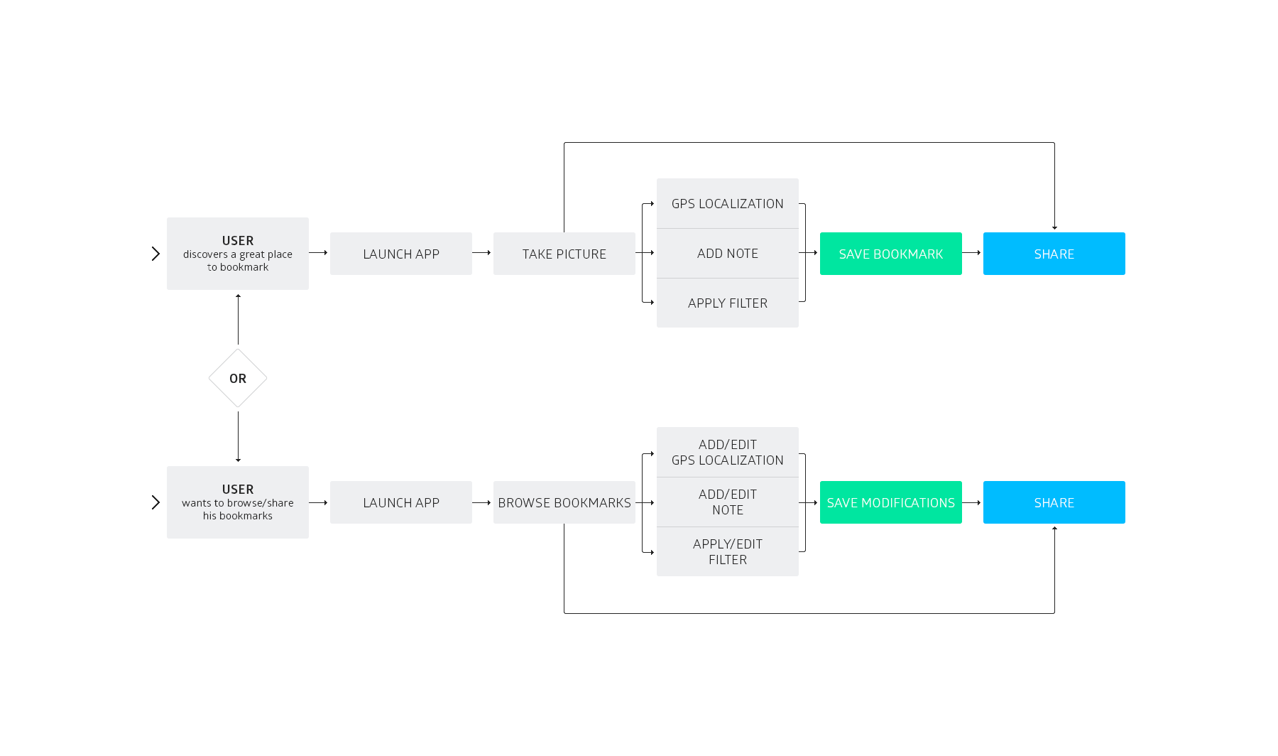
Based on initial meetings with the Picplace Team, I defined the user journey for the new version of the product. The document represents the scenarios in which the user will be involved.
6. App Map
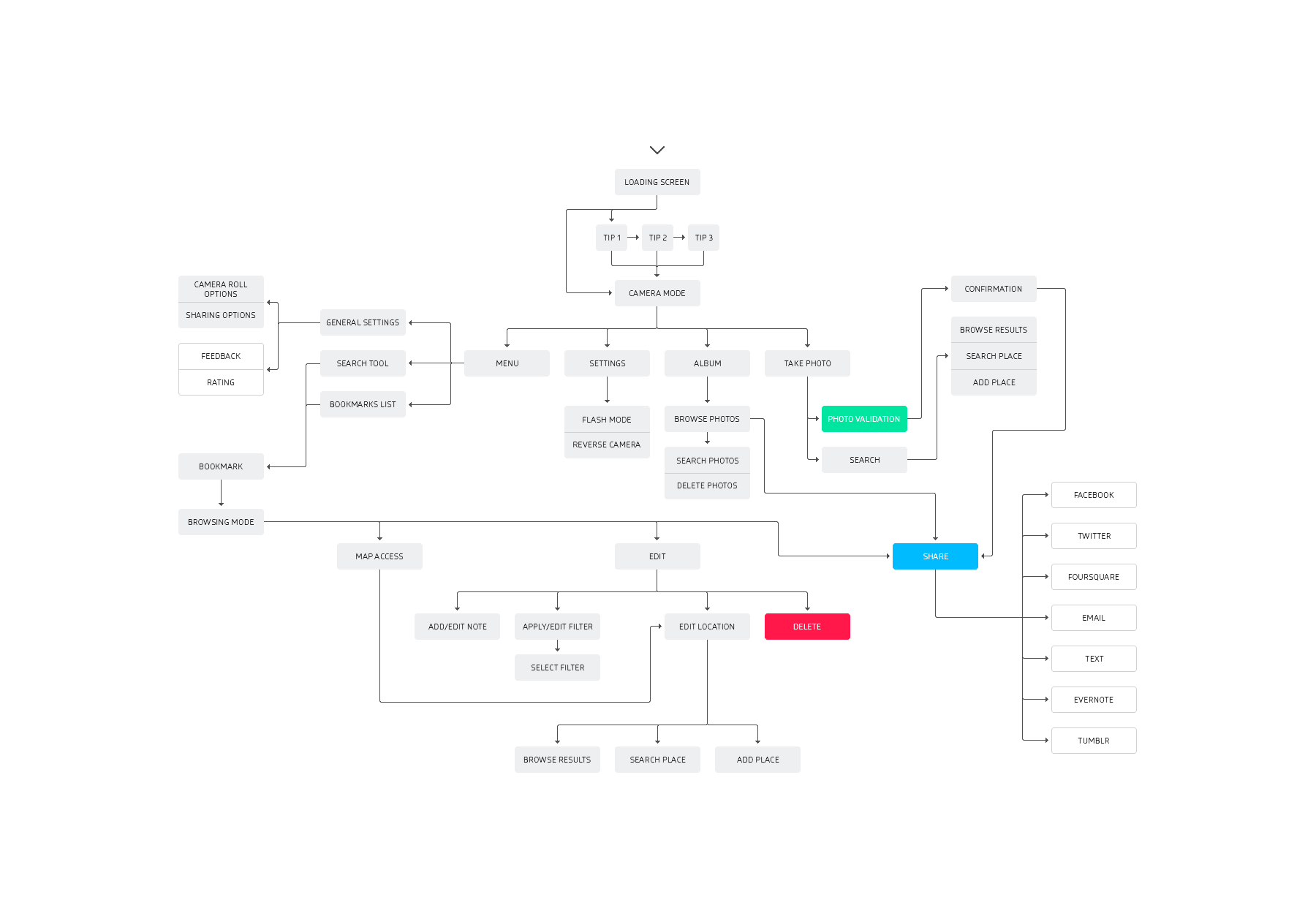
I also provided an extensive app map showing the structure and relationships between the various screens. This hierarchical diagram served as the basis for the creation of my wireframes.
7. Wireframes
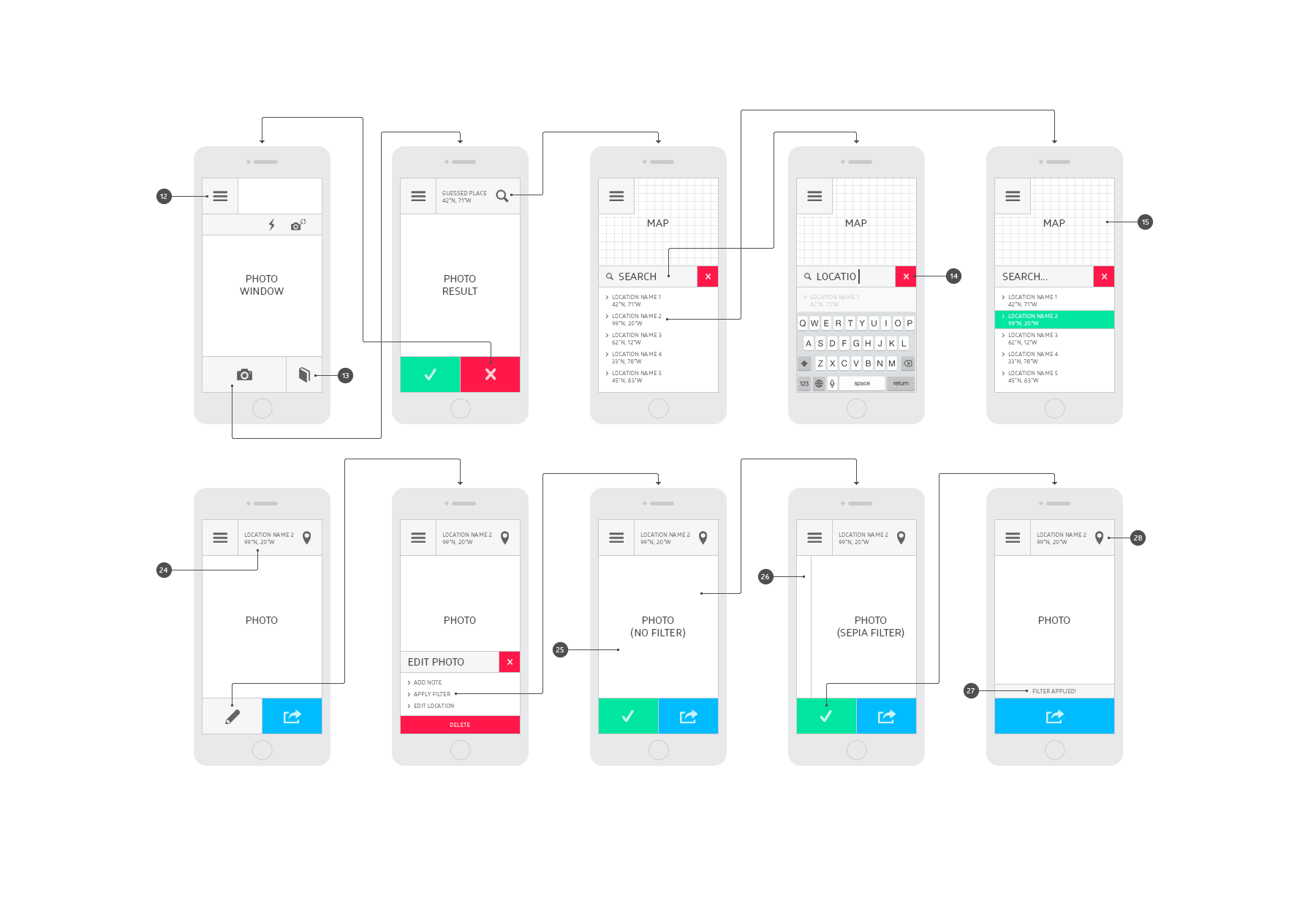
I created the wireframes and organized them as storyboards along with detailed annotations, showing functional specifications. It was a great opportunity for me to introduce concepts and new designs to the Team as well as discussing feasibility with the Apps developers.
8. Visual Design
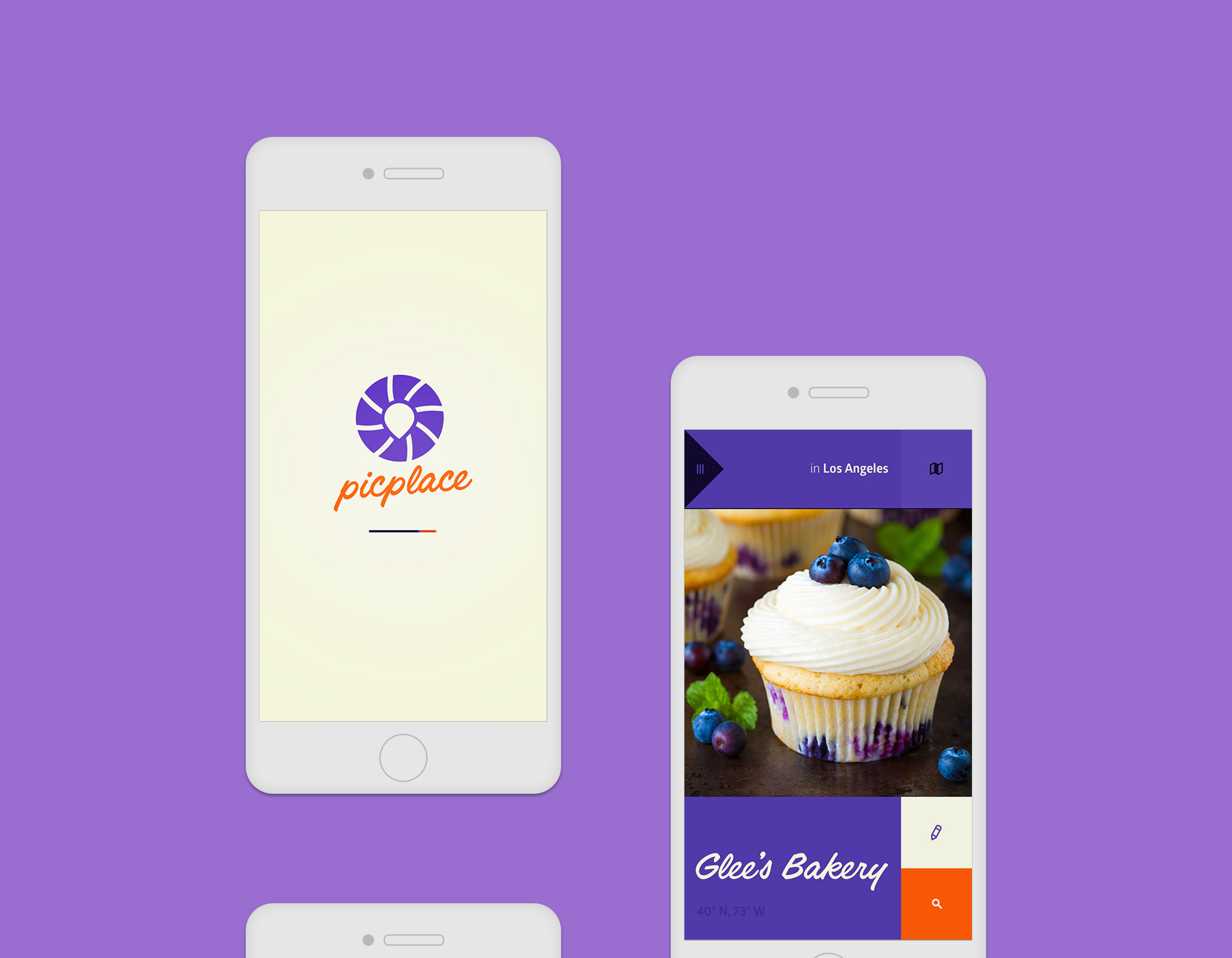
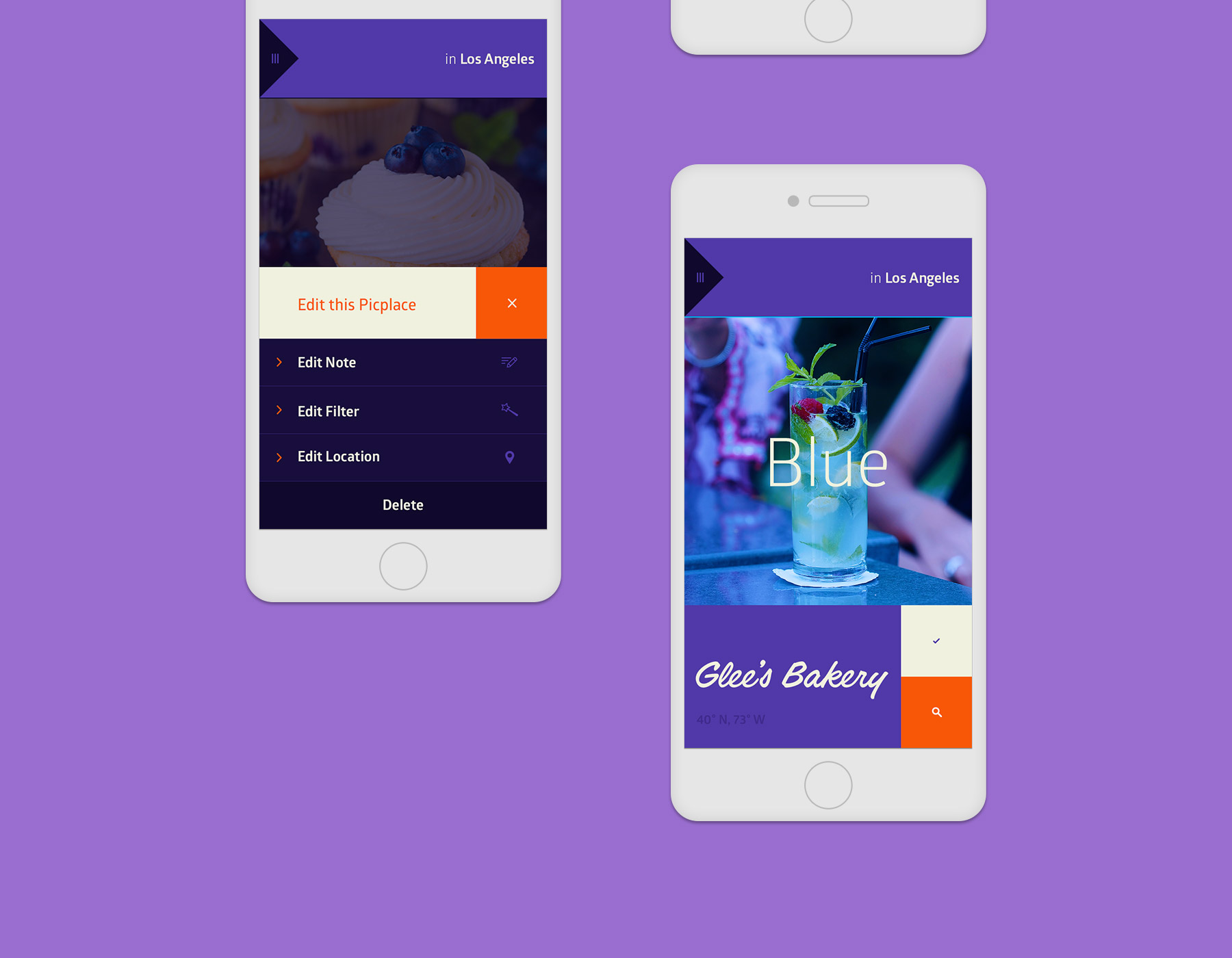
With the established branding, I created new designs that would appeal to young urban people and travelers. My visual comps included new icons to illustrate new features and functionalities such as photo filters, maps, journal, etc… In order to ensure consistency across the App, I also designed customized alerts, share screens, and pop ups. Finally, I was able to build an interactive prototype—that combined several screens—with InVision.

9. Usability Testing
Before meeting testers, I compiled all possible scenarios to ensure quality assurance. Then, I drafted questions regarding their use of the device either during the week or when traveling abroad. In addition to survey results, I needed to identify their habits in different scenarios: finding restaurants or meeting friends in specific neighborhoods. We launched the latest App build, and I recorded their comments about the layout, menu access, photo window, and sharing options. Then, I conducted usability testing to determine if new features had met the objectives. I asked each tester to complete 3 tasks:
• Create a bookmark with name and location and apply a filter
• Find a bookmark previously saved on the map view
• Create a post in the journal with a caption
I translated the recorded materials to text documents and I met with the Product Owner. We discussed the positive feedback, and began revisiting some areas to increase performance.
—
App Store
Download Picplace >
—
Downloads
3,000 total download
—
Company Website
Visit picplace.co >

