PROJECT BACKGROUND
Recent studies reveal that the majority of digital media consumption now takes place via mobile apps. Mobile marketing and eCommerce platforms are increasingly important, and will become more and more profitable for retailers. As of early 2016, studies indicate that 30% of all online shopping purchases happen on mobile phones. Acknowledging these facts, I wanted to revisit—as an exercise—the iOS App of a popular designer, manufacturer and retailer. For this redesign concept, I created a mobile interface featuring new collections, product summaries, and news. While introducing new functionalities, the intention was for a clean, consistent and readable look. It provided a great opportunity to explore in depth the Apple iOS Human Interface Guidelines.
1. User Objectives
• To browse the latest collections
• To purchase products on their device
• To receive exclusive promotions and offers
• To discover the latest trends, news, and videos
• To be inspired by fashion images and lifestyle galleries
• To share items with friends and family through social media
• To receive relevant alerts reflecting their taste
• To use GPS technology to find the nearest store
2. Problem
• Current iOS App does not allow the users to buy products
• Compatibility is now dated (requires iOS 5.0 or later.)
• Layouts are not adapted to most recent devices
• App does not allow users to play videos content
• Competitor’s Apps offer a better look and feel
3. Research
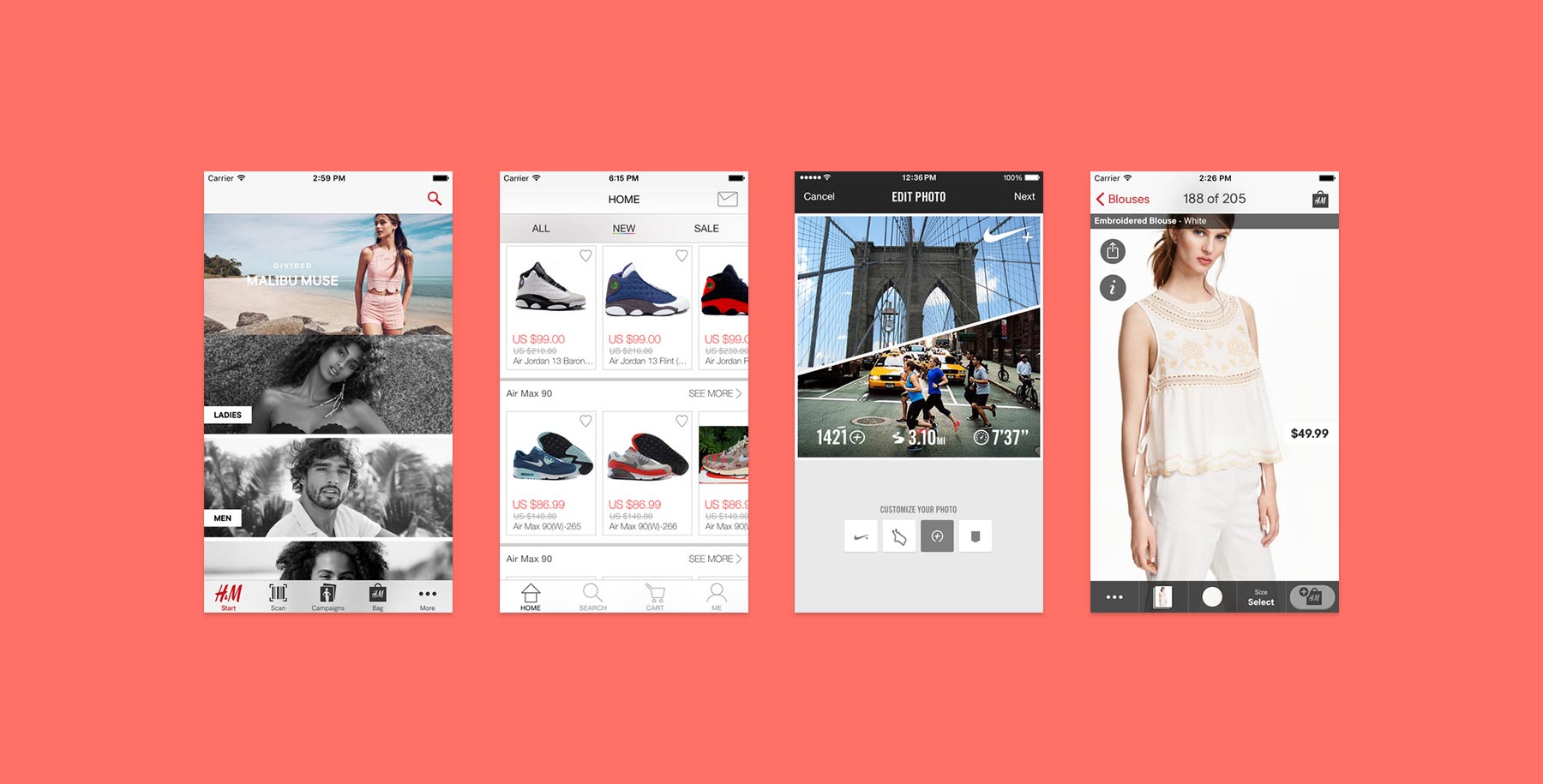
In the beginning, I started to read about user studies and consumer reports. I downloaded and tested the most innovative eCommerce mobile apps listed in UX design articles.
INDUSTRY
Fashion & Retail
PERSONAL
Redesign Concept
MY ROLE
Mobile Designer

I researched how the market has evolved and which apps have generated the highest numbers of orders. These steps helped me to determine user behavior. From a design perspective, I decided to focus on responsiveness, secure payment systems, browsing experience, GPS technology, and sharing tools. I created a mental model as well as a competitive analysis.
4. Solution
• Conceptualize and design a fast and easy buying process
• Develop a GPS functionality to locate the nearest offline store
• Drop iOS 6, and develop for iOS 7, 8, and 9 mobile devices
• Reorganize information architecture
• Modernize the layout according to latest visual trends
• Redesign navigation tools, iconography, and color palette
• Incorporate sharing options via email and social
• Customize alerts, share screens, and flyout menus
5. Wireframes
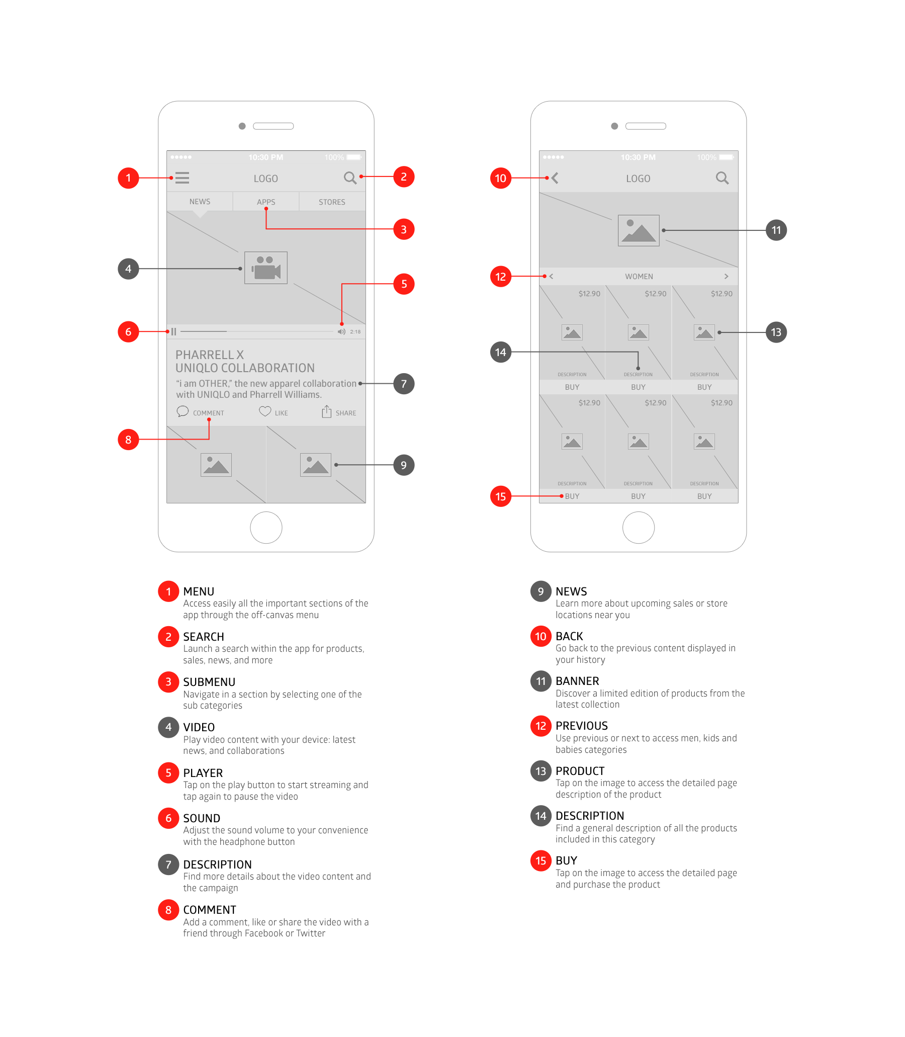
I created the wireframes with detailed annotations, showing functional specifications. This step was also a valuable opportunity to revisit hierarchy and establish new layouts.

6. Visual Design
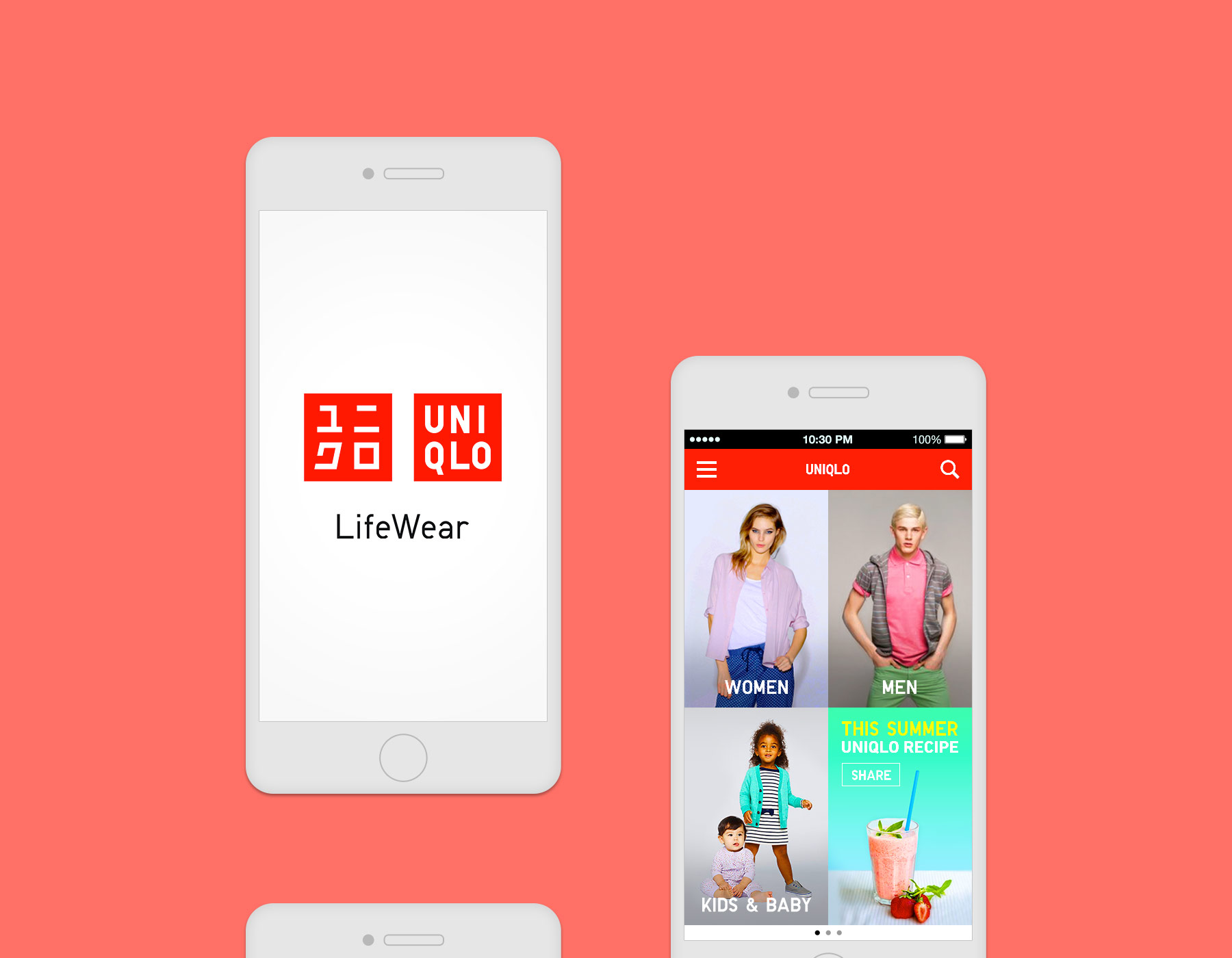
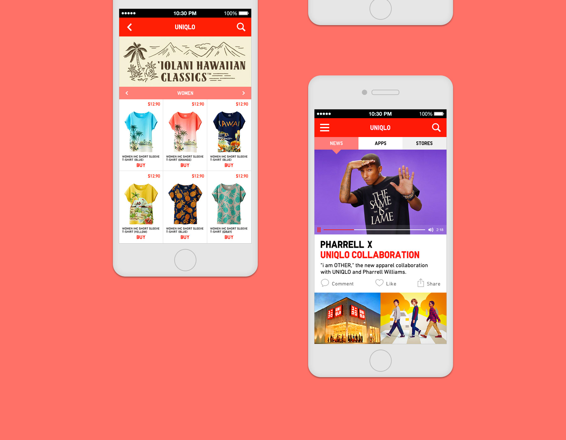
To follow up on my research on competitors’ products and visual trends, I created visual mock-ups based on the wireframes. The design comps include navigation tools, iconography, and imagery to enhance usability and user experience.


